

Digital Water Plant
A digital waste water management plant “twin” that gives recommendations to make a physical plant more efficient, reliable, and cost effective.
Problem
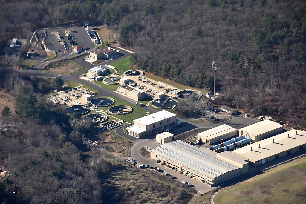
A research team from GE Global Research reached out to my company for help with making a demo as a proof of concept. Their goal was to try to get more funding and a potential waste water management plant interested in working with GE. Waste water plants currently use 2% of all of the energy that is used in the US. Most of this energy is used to power the aerators that are located in the sludge beds to keep the sludge microorganisms alive to be able to break down waste. There are four main issues:
- Process Visibility
Having insights into what is happening in the rest of the sludge bed even though there is usually only one sensor installed - System Health
Seeing large trends of data to see when the plant starts drifting towards problems so they can be fixed - Real-time Optimization
Ability to make subtle or quick changes to prevent problems down the road - Decision Support
Having a list of possible actions to take to improve how the plant is functioning
If waste water plants could have insights into how their plant is operating and see the trends of that data, they could better see when they need to be making changes to the state of the sludge. As soon as problems are identified, they could see suggestions of what to do to react to the problems immediately and stop them in their tracks. Running a waste water plant is a big balancing act. When a sludge bed dies, it takes 30 days to build a new sludge bed, which is costly and dangerous to not have a fully functioning waste water plant. On the other side of the coin, a plant has to make sure they don’t produce too much sludge. When too much sludge is produced, the plant has to get rid of the sludge, which is pricey and bad for the environment because it’s biohazardous waste. At the same time you need to think about the cost of running the aeration pumps. If they aren’t run enough the sludge will die and if they are run too much it could cause an overproduction of sludge and would cost a lot to keep the pumps running. On top of all of this is the fact that a sludge bed can go from healthy to unhealthy in the matter of a few hours. Most of the plants in the US were built in the 1970s and 80s and don’t have much technology, so plants don’t see snapshots enough times during the day to catch the subtle changes until the sensor says that it has bad readings.
One reason for the push on this project is that the current workers, although very experienced, are starting to retire and passing on the experience to the next generation isn’t easy. For more about the problems involved, there was a video produced as part of this project to convince plants to work with GE.
Users & Audience
We created 3 personas based off research and initial user interviews:
- Utility Manager:
In charge of many plants and makes sure that they are reliable, safe, and run as efficiently as possible - Utility Engineer:
Ensures the plant is operating within specification and as efficiently as possible on any given day - Plant Manager:
Makes sure the plant isn’t having any problems and looks for new ways of making the plant more efficient, automated, and easier to operate

Our biggest takeaway from persona ideation was that our users had very similar goals. While one of the users needed to be able to see all of the plants and the other two only needed to see one; they were all interested in the same data, but using it in different ways.
Product Team
My role on this project was as a UX Designer and Product Manager. The team during the first demo consisted of a Developer, a Visual Designer, a Video Editor, a UX Designer, and myself. The other UX Designer and I collaborated frequently sharing research and design ideas. As Product Manager I was responsible for tracking developer and design progress and bug fixes. As UX Designers, we were ultimately responsible for multiple iterations of wireframes that were passed off to the Developers. During the second demo the team consisted of a Developer and myself.
Constraint
Predefined Predix Style Guide
Since we were working with GE, we were required to use the look and feel of Predix. This caused some issues for the type of charts that we could use since their version of Highcharts didn’t include a couple common types of charts that the client wanted to show. We found ways of making charts that looked similar to what they were looking for, but ultimately those charts wouldn’t have been able to work in the actual application.
First Demo
Design Process
We were given approximately three weeks to get this demo working. I worked with the other UX Designer and Visual Designer to sketch and white board ideas. Once we were comfortable that we had talked out the ideas, the other UX Designer or I would switch over to wireframing in Axure RP. We came up with a couple of iterations of the dashboard to show everything that the client was looking for in the first screen. We went back to the client a couple times to get certain things clarified and to show progress as we went along.


Once the wireframes were approved, we turned them over to our developer to start making the demo. We created a handful of clickable wireframes, identified issues, set priorities, and assigned sprints. To ease some of the pressure on our developer with the short timeline, I sanitized the data into a useable form for Highcharts and designed some of the code for the actual charts.


We finished the demo with a few days to spare. The client was very happy with how the demo turned out. He reported back from his presentation that they had a lot of interest from their client, GE Power and Water, and they would be going out and selling to waste water management plants.

Results
The client reported back to us a few months later that they had gained the interest of two plants to have GE’s system implemented. This would provide valuable data so they could start predicting data for other plants. One of the plants would have a subscription to the optimization part of the application so it could react to changes. The other plant wouldn’t have a subscription, but would just be reporting data and getting trends.
Second Demo
Design Process
We were contacted approximately five months after the first demo to create a second demo that would be given to the CEO of GE Power. We had approximately one month to complete this demo. We worked with a lot of the same materials we had in the first demo, but because of the short time frame our client had to present, we needed to change the demo. For this demo we concentrated on the optimized versus non-optimized versions, as well as the health forecast.
We started the process by sitting down with the client and going back through the demo we had created before and stripped out everything that wasn’t necessary for this demo. I then went back through the wireframing process. I started by implementing multiple pages for each part, but the client thought it would take too long to get through the demo. We decided that the best way to do this demo would be to have everything on one page. The client wanted a way to start, pause, and restart the data in the charts. They also wanted a way to start from a certain day and be able to control how many data points the charts moved by. I went back and worked closely with the developer to figure out a way to achieve these goals.

Once the wireframe was done and approved by the client, we moved onto developing the demo. For this part, I was responsible for sanitizing the data as we got it from the client and double checking to make sure the actual demo had everything that was in the wireframes for functionality. A week before the demo, the Developer finished the main part of the coding, minus the correct data from the client, and it was approved by the client.

There were many iterations of data received from the client, the last of which was the night before the demo. The final demo went well and the CEO was very pleased with it.
Results
We heard at the beginning of this demo that GE was planning on selling GE Water to another company. The client reported back to us a few days later that everyone was very pleased with how the demos turned out. They told us that GE had been able to finish the sale of GE Water to the other company thanks to the demos that were put together.
Retrospective
One thing I learned during this project was that data from simulations isn’t always what the client expects it to look like in the charts. This causes multiple iterations of data and multiple times sanitizing data. In the future it would be good to set a meeting with the client where they could load data on the fly to see different charts quicker.